CISCO MOBILE DESIGN SYSTEM
DESIGN SYSTEMS // UI // UX
Platform: Mobile app
Timeline: January 2023 - Present
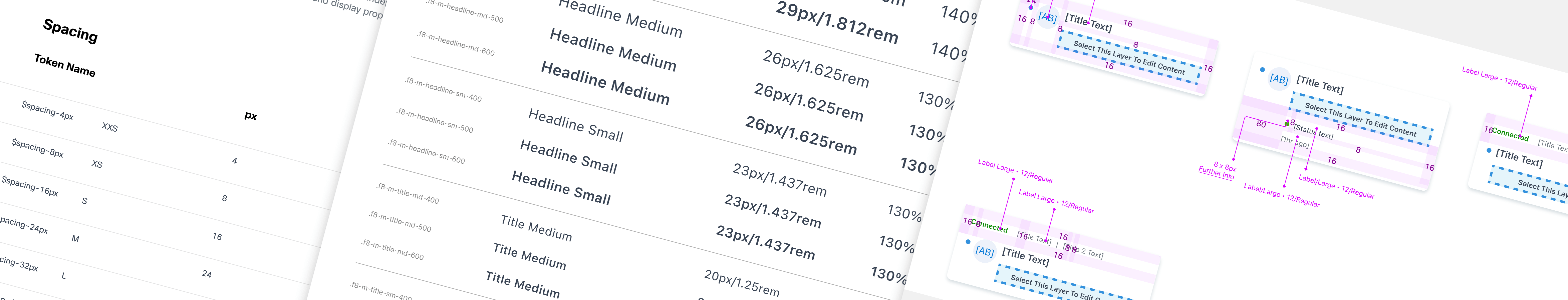
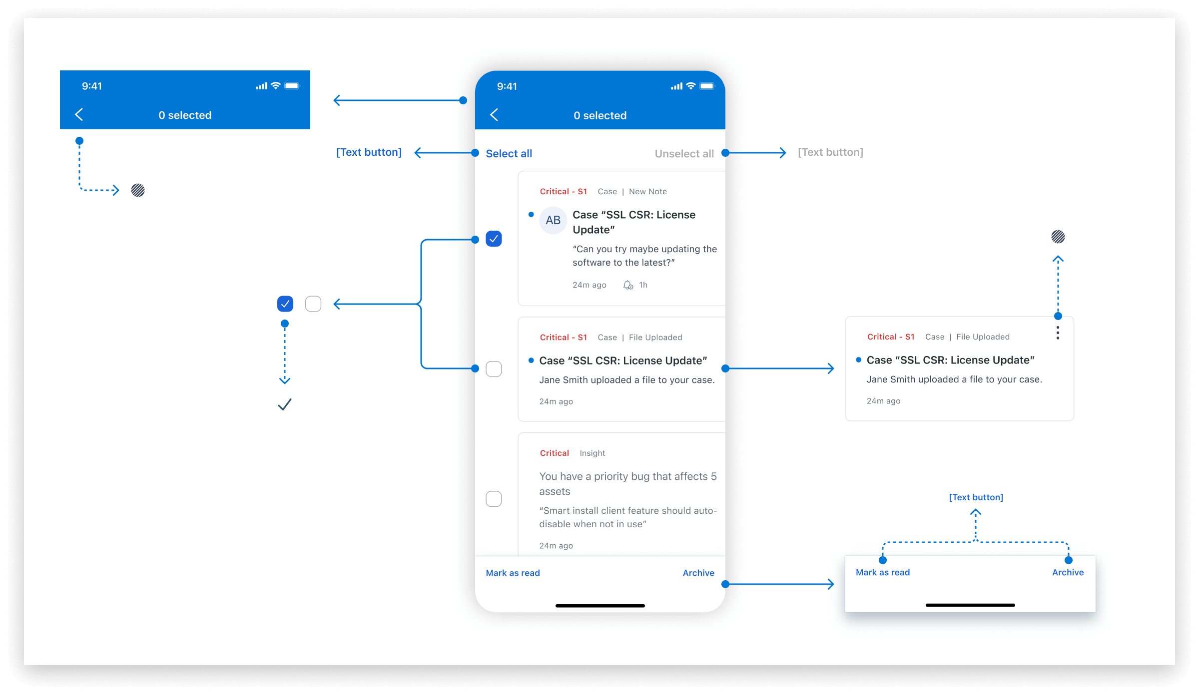
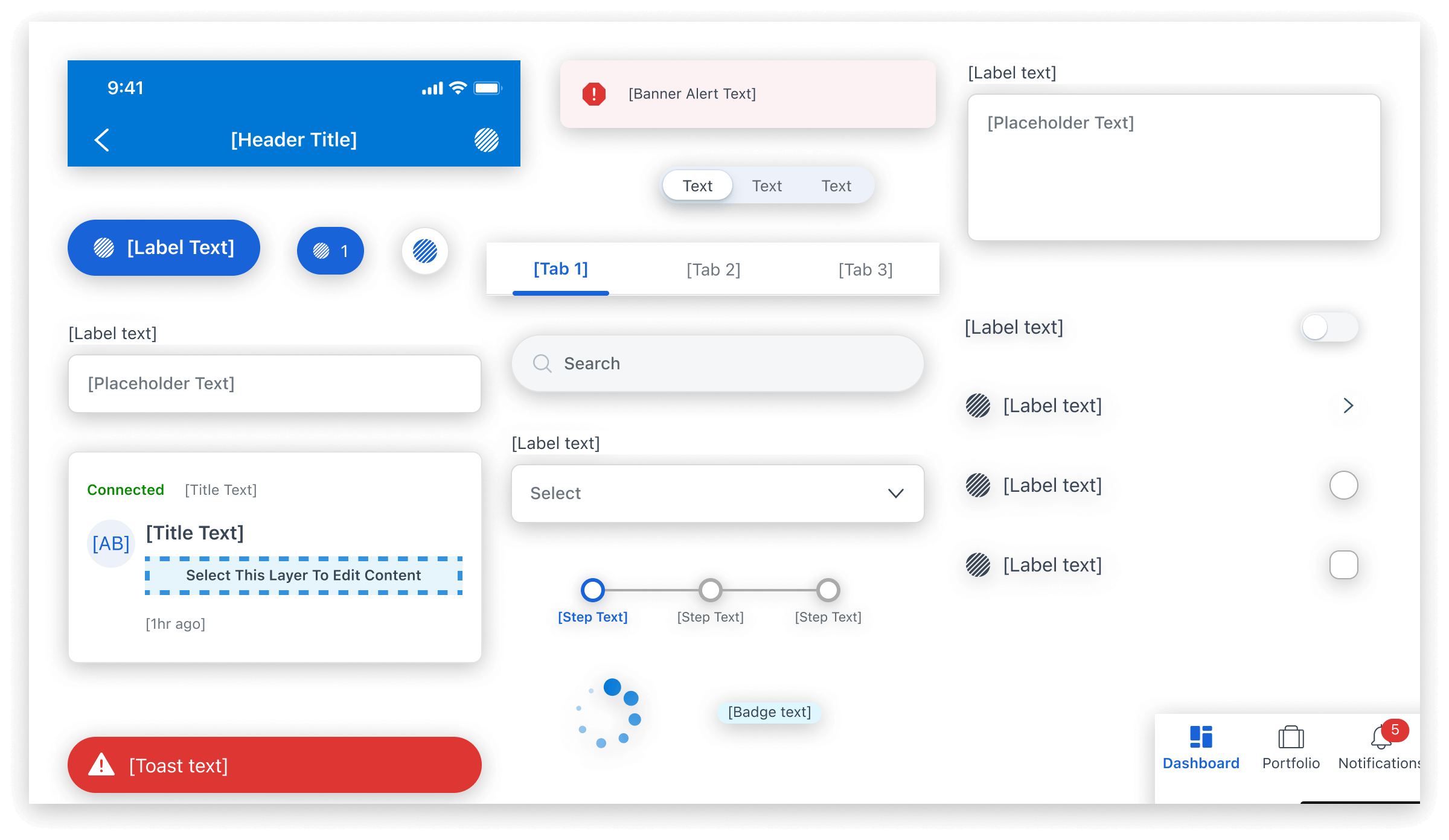
For this project, I created a mobile component library with over 90 components to support the CX Cloud mobile app. This library was aligned with the design system specifications used for the CX Cloud web app, ensuring consistency in design language across both platforms.
Before my involvement, the mobile team had been designing and creating a system on the fly, resulting in a system that didn't follow the established desktop guidelines nor did they adhere to general accessibility guidelines. I addressed this gap by unifying the design, look, and interactions across both platforms and addressed color and screen reading issues with the designs and components.
RESPONSIBILITIES
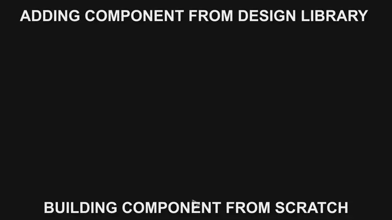
- Create a brand new Figma Component Library
- Facilitate the Design to Development process
- Build a bridge between Design Systems and Product Design teams
ACCOMPLISHMENTS
- Create a brand new Figma Component Library
- Created and maintained over 90 Figma components
- Connected development assets with proper design system tokens
👇 CHECK OUT THE PROJECT WRITEUP 👇
DESIGN SYSTEMS ARE YOUR FRIEND
Working with a dedicated design system team was new for the mobile team. Understanding that designers often view design systems as restrictive, my goal was to minimize friction while advocating for a structured approach.
Properly built design systems eliminate wasted time spent on common design assets, allowing designers to focus on more engaging problems. For example, saving 10 minutes on making an input field repeated 6 times frees up an extra hour the designer could've spent solving a more exciting task.
SEAMLESS INTEGRATION
From day one, I positioned myself as a supportive designer, aiming to assist the team and enhance their creation process. Initially, I acted as a visual designer, which achieved two goals: building trust and showcasing my design skills while gaining insight into the mobile app flows and requirements.
Over time, the team became comfortable seeking my input, asking about Figma functionality, and using components in their existing design system.
IF WE BUILD IT, THEY WILL... DESIGN WITH IT
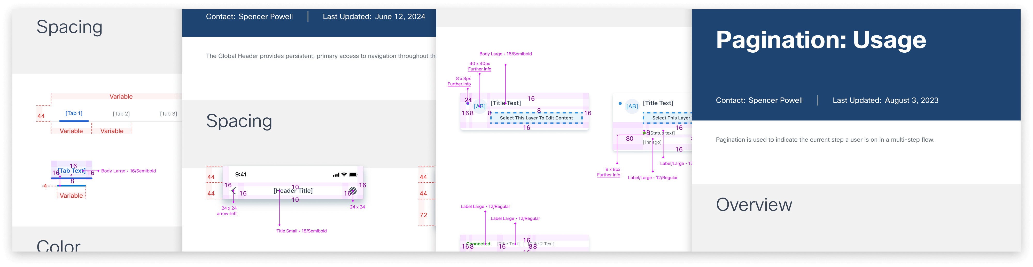
Within a short time, I had a working understanding of the app designs and a list of components to start the new component library with. At the time, the number of components was roughly 70 but that number would expand to just over 90 total components when the library would launch about one year later.
FIGMA EDUCATION
To minimize friction in the mobile team’s workflow, I held mini-workshops to gather feedback on components as I created them. I identified opportunities to enhance their understanding of advanced Figma features to better use the component library.
I organized additional workshops and presentations on advanced concepts, including styles, component properties, and more. This approach led to visible success, with the team applying these concepts in their designs 🙌
CONTINUOUS LAUNCH
The mobile library launched in August 2023 and was quickly adopted in new designs. Within 4 months, all previous designs were retrofitted to use the new components and styles, aligning the mobile version of CX Cloud with the desktop product. This created a seamless experience for customers transitioning between desktop and mobile.
As the mobile app and component library evolve, I regularly align with mobile designers, the design system Visual team, and mobile developers to address needs and communicate system changes. I also write detailed specification documents for new designers and developers, including redlines and style breakdowns, to guide the use and coding of components.
More stuff...
Cisco Desktop Design SystemUX // UI // Design Systems
ReservoirUX // UI // Branding // Onboarding // Art Direction

AlphaCubeUX // Digital Assets // E-Commerce
MAN Trucking AssistantUX // UI // Mobile // Branding // Art Direction

Uber FreightUX // UI // Mobile // Freight Solutions // Concept
THANKS FOR STOPPING BY, LET'S CHAT 👉 ME@SPENCERPORAUT.DESIGN