CISCO DESKTOP DESIGN SYSTEM
DESIGN SYSTEMS // UI // UX
Platform: Web app
Timeline: May 2022 - Present
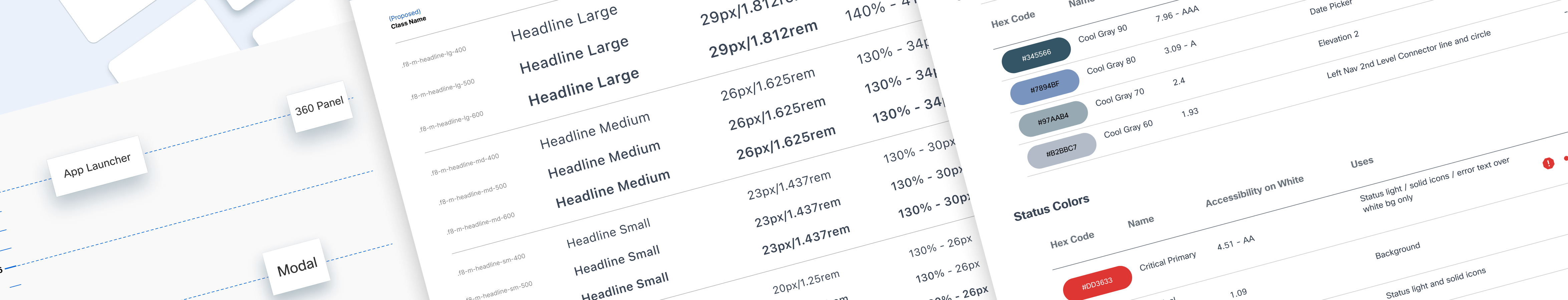
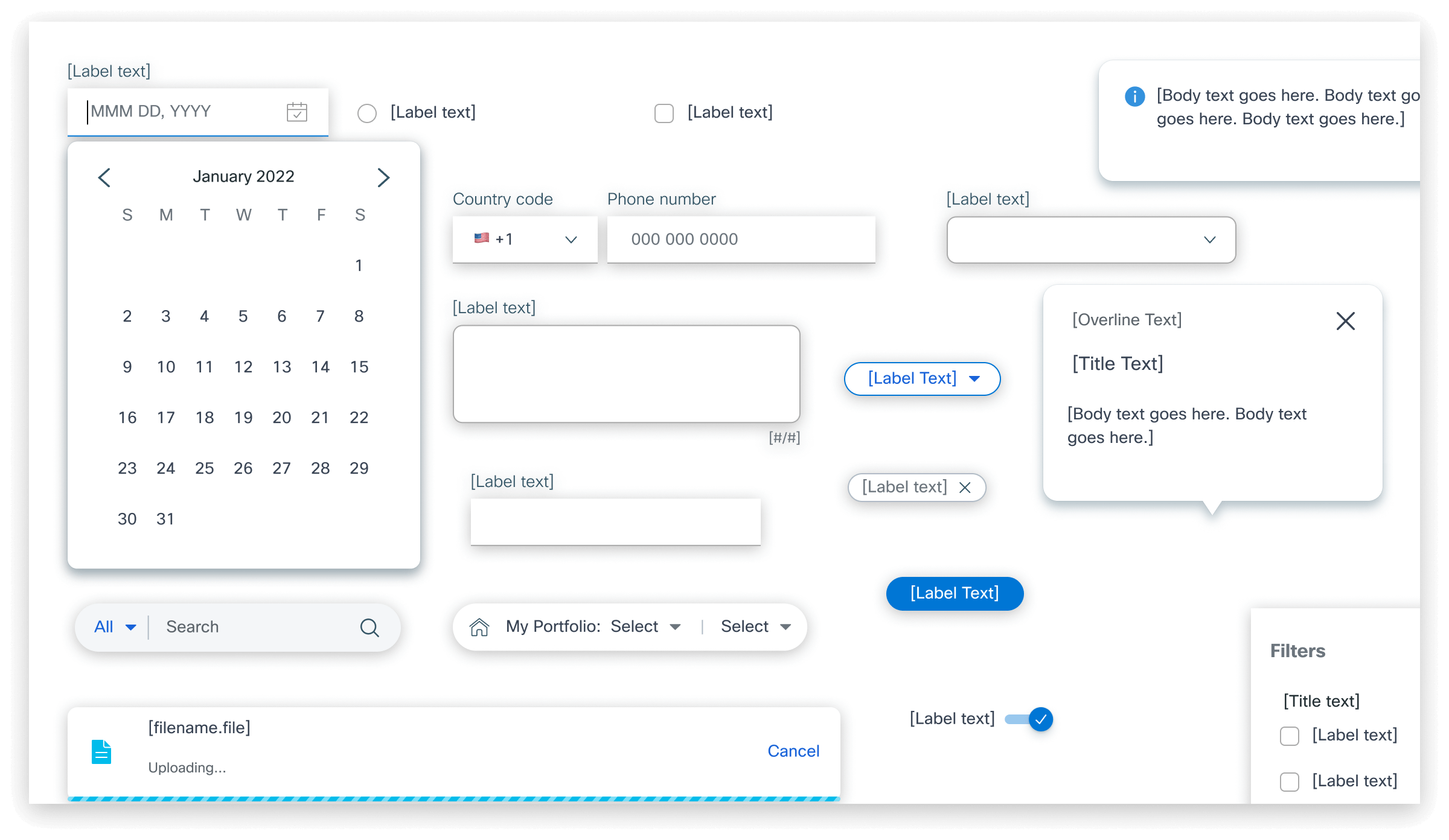
Upon joining Cisco, I collaborated with another designer to build and maintain the new Figma Design System supporting the CX Cloud web app and a suite of other products. I contributed to the creation of over 100 new Figma components, including over one thousand variants, established a pipeline to translate these components into development, wrote usage documentation for designers, and migrated components and documentation to the Zeroheight platform that hosts the system.
Additionally, I served as a Figma Expert at Cisco, elevating the proficiency of the broader design and engineering teams through one-on-one sessions, workshops, and the creation of educational materials.
RESPONSIBILITIES
- Create and manage a new design system
- Perform competitive research to improve the system and its components
- Be an advocate for Figma and increase others understanding and familiarity with it
ACCOMPLISHMENTS
- Created over 100 Figma components, including over 1000 variants
- $1.5+ million in time saved per year due to efficiencies provided by the new system
- 100% system adoption among track teams with only 3% component detachment rate
- Design System adopted by 75+ teams that contained 130+ designers
👇 CHECK OUT THE PROJECT WRITEUP 👇
STYLES & PAGES & COMPONENTS, OH MY!
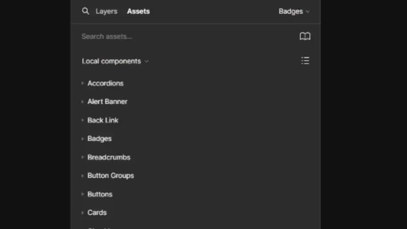
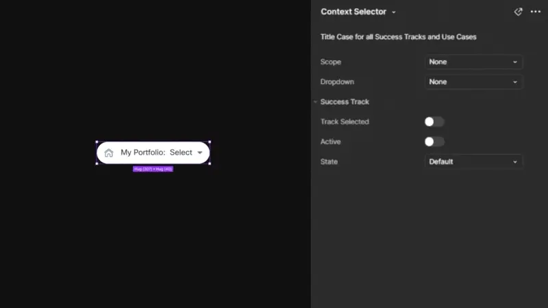
The component backlog I started with was well over 100 components that would require over one thousand variants. After researching various design systems, I worked with my team to reorganize the component taxonomy and system layout. Our main goal was to make it easy for designers to browse and search for components, using a wide array of metadata tags we added to the library.
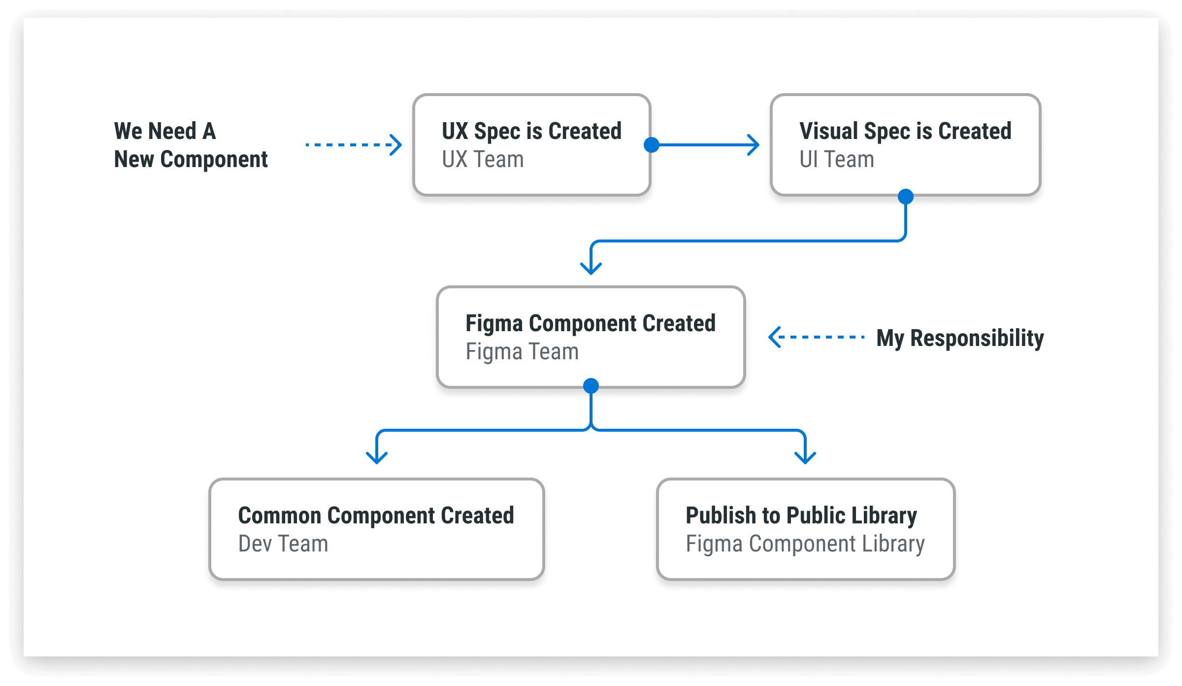
A WELL-OILED MACHINE
The design system team was an efficient machine comprising of:
• UX Team - focused on the component interaction design
• Visual Team - focused on what the component would look like during every interaction
• Figma Team - myself and a colleague - focused on translating the previous team's specifications into usable Figma components for designers on other product teams
• Development team - focused on taking the Figma components and creating coded common components for the other product team's developers
DESIGNERS DESIGNING FOR DESIGNERS
Designing for fellow designers required a shift in perspective. I had to think like a typical Cisco designer facing tight deadlines, shifting goals, and mandatory use of a design system. I identified key pain points: transparency to quickly find components, flexibility, and ease of modification. To validate these assumptions, we gathered feedback through questionnaires, workshops, and multiple rounds of testing with internal designers.
ONE BIG JIGSAW PUZZLE
Creating truly usable components requires balancing customization—too little limits flexibility, while too much makes them difficult to use, leading designers to detach them from the design system. To solve this, I used advanced Figma features like variables, variants, and properties to build highly customizable yet intuitive components. This approach resulted in a detachment rate of less than 3%, a clear success!
HOUSTON, WE HAVE LIFT OFF
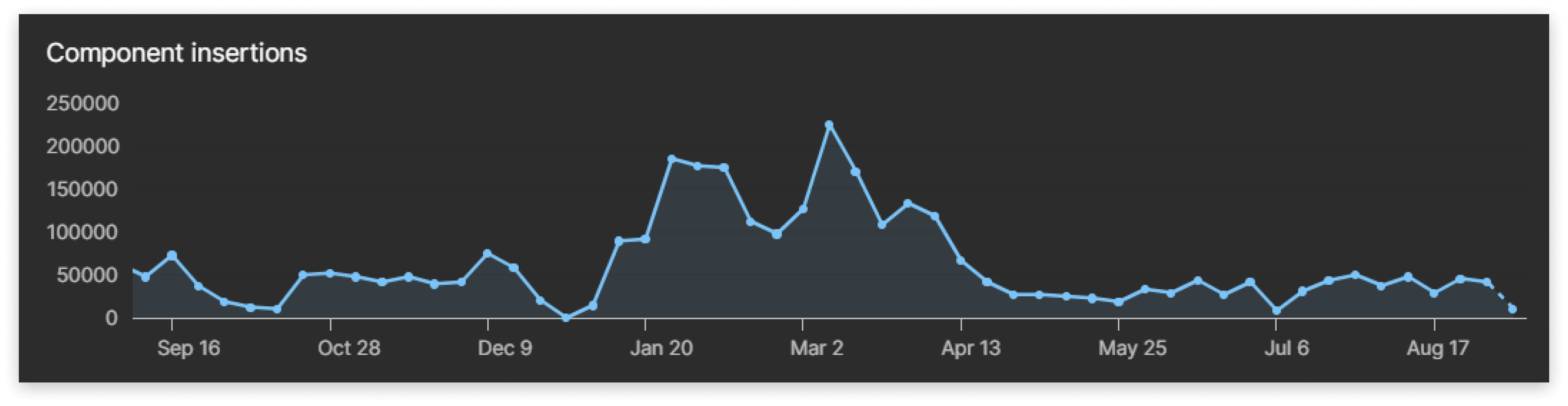
Shortly after the system's launch, component inserts surged into the thousands, reaching tens of thousands within weeks, and now nearing 2 million inserts across 75+ internal teams with a detachment rate of less than 3%. I continuously refined components to add functionality, introduced new ones to meet team needs, improved searchability by adding metadata tags, and wrote specification documents to guide new designers on component functionality and usage.
Then a new opportunity crossed my path that I was eager to take on, the Mobile Component Library.
More stuff...
Cisco Mobile Design SystemUX // UI // Mobile // Design Systems
ReservoirUX // UI // Branding // Onboarding // Art Direction

AlphaCubeUX // Digital Assets // E-Commerce
MAN Trucking AssistantUX // UI // Mobile // Branding // Art Direction

Uber FreightUX // UI // Mobile // Freight Solutions // Concept
THANKS FOR STOPPING BY, LET'S CHAT 👉 ME@SPENCERPORAUT.DESIGN